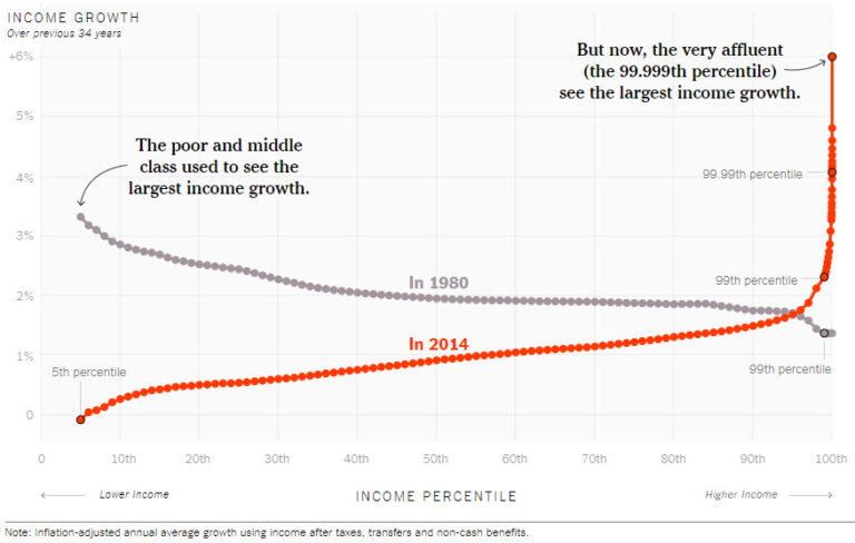
This weekend, I stumbled across an article in the New York Times, Our Broken Economy, in One Simple Chart, that attempts to freak us out with wowzer visuals. The charts are definitely impactful and appear to represent a disturbing trend. However, I think the narrative is a little off. As with most data, it’s about interpretation.
First, this is a poorly written excerpt:
The line on the chart (which we have recreated as the red line above) resembles a classic hockey-stick graph. It’s mostly flat and close to zero, before spiking upward at the end. That spike shows that the very affluent, and only the very affluent, have received significant raises in recent decades.

The reader immediately associates ‘significant raises‘ to salaries. Wait, wages are the only thing accounting for the parabolic moves in the 1%? It’s implied that getting a larger salary explains it all and we should be pissed that our salaries haven’t been going up like theirs. Sure, there is no doubt that salaries at the top are probably going up at a faster rate than the rest of us, but that’s not what the chart is representing, thus misleading. Maybe the author should write an article about SALARIES instead of representing INCOME as salaries (finger wag).
The charts reference growth in income (actually says that ON the chart, but not in the text of the article – odd). The author keeps referencing raises and salary based arguments. This is unfortunate. The charts represent income (filed to IRS) and guess what kind of income the top have accumulated? Huge, compounding interest income on investments.
There are two different things going on in this article and the author doesn’t take the time to separate them out. The first being that year-over-year income growth has steadily been going down for the poor and middle class. It’s important to recognize that for most of the population, salaries make up most, or all, of their income. This decline should be the entire focus of this article. Instead, the author tosses in the top 1% line and implies comparability. Nope, nope, nope.
The red line, representing the steady growth, then hockey stick boom needs to be understood, but not as a comparison to everyone else. This group has that distinguishing difference – most of their income comes from investments. They then take their investment income and reinvest it. What you end up with is billionaires compounding their wealth at a level the rest of us will never understand. And, importantly, it’s not at the expense of everyone else, it’s just a fact of compounding interest. Absorb this image and you’ll start to see what’s going on at the top.

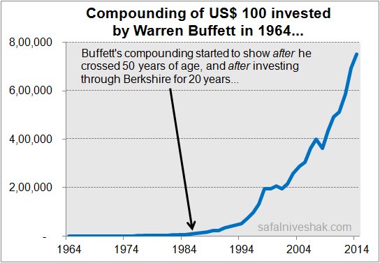
Now, let’s look at the charts of the mega rich, Koch and Buffet:


See anything familiar? Yes, their compounding income growth looks a lot like the chart from the article – a staggering growth in income over the last few decades at the top.
So, is this bad? My initial impression was, yes, of course. But, when you step back, what we see is just a small group of people stepping over the threshold where compounding interest represents staggering numbers (money in this case). When you compare this to the rest of the population who doesn’t save much and invests very little, the picture makes sense.
Let’s focus on salaries, cost of living, availability of basic services like healthcare, and the staggering cost of education. It doesn’t do any good to fight math and what’s going in the top 1% of the population. What we should hope for is that they are willing to put the money back into the market (Bill Gates) to help others and grow our economy. Should we make them give it back? Well, that’s up for debate and likely addressable in taxes. Too bad those in power who would apply specific tax rates to the top 1% would never do it – you know, campaign contributions, etc.
Live. Focus. Grow.


